

John Canemaker 2014


Contemporary animation art director Fred Cline wrote this about Blair...
juxtaposition of neutralized and intense colors. Lots of artist make everything really bright or really mute. She mixed both with a graphic sense without hardness. Her shapes are very organic but graphic. It's different. You know you're looking at something only Mary Blair did.
Blair's sensual spheroid, biological, abstract forms communicate solace, comfort, joy, and pleasure to the viewer. Combined with Walt Disney's paean to the nation's heritage and values, her art became a reassuring expression of faith in, and hope for, America's future.
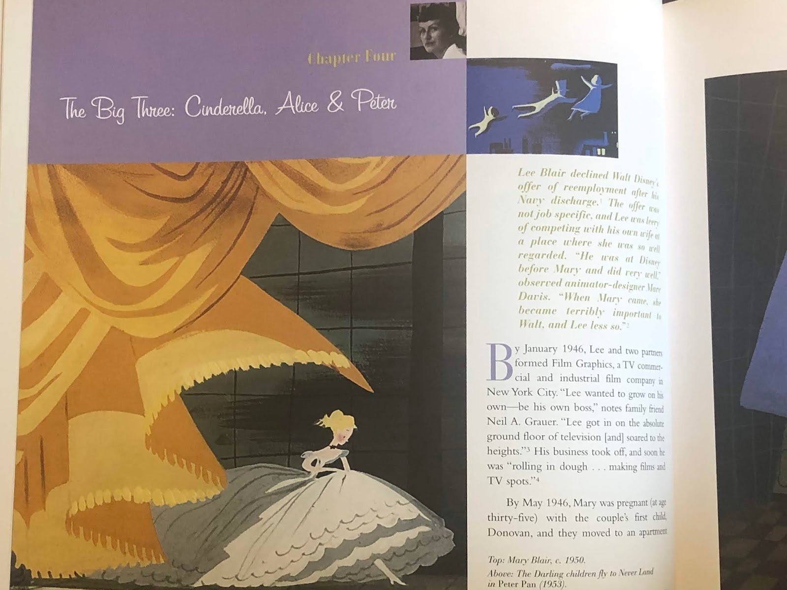
By 1948, Disney decided to reenter the feature-length animated cartoon arena. Cinderella, followed by Alice in Wonderland and Peter Pan, released between 1950 and 1953, bear Mary Blair's artistic imprint in varying degrees. The last animated features she worked on, these three films represent a renaissance of the form and the beginning of a period of unprecedented growth and success for the Disney studio.


Blaire's dynamic interaction of colors- the way foreground and aground hues affect spatial perception, the multiple readings available from a single color depending on what color surrounds it- intuitively put into play theories of painter Josef Albers.
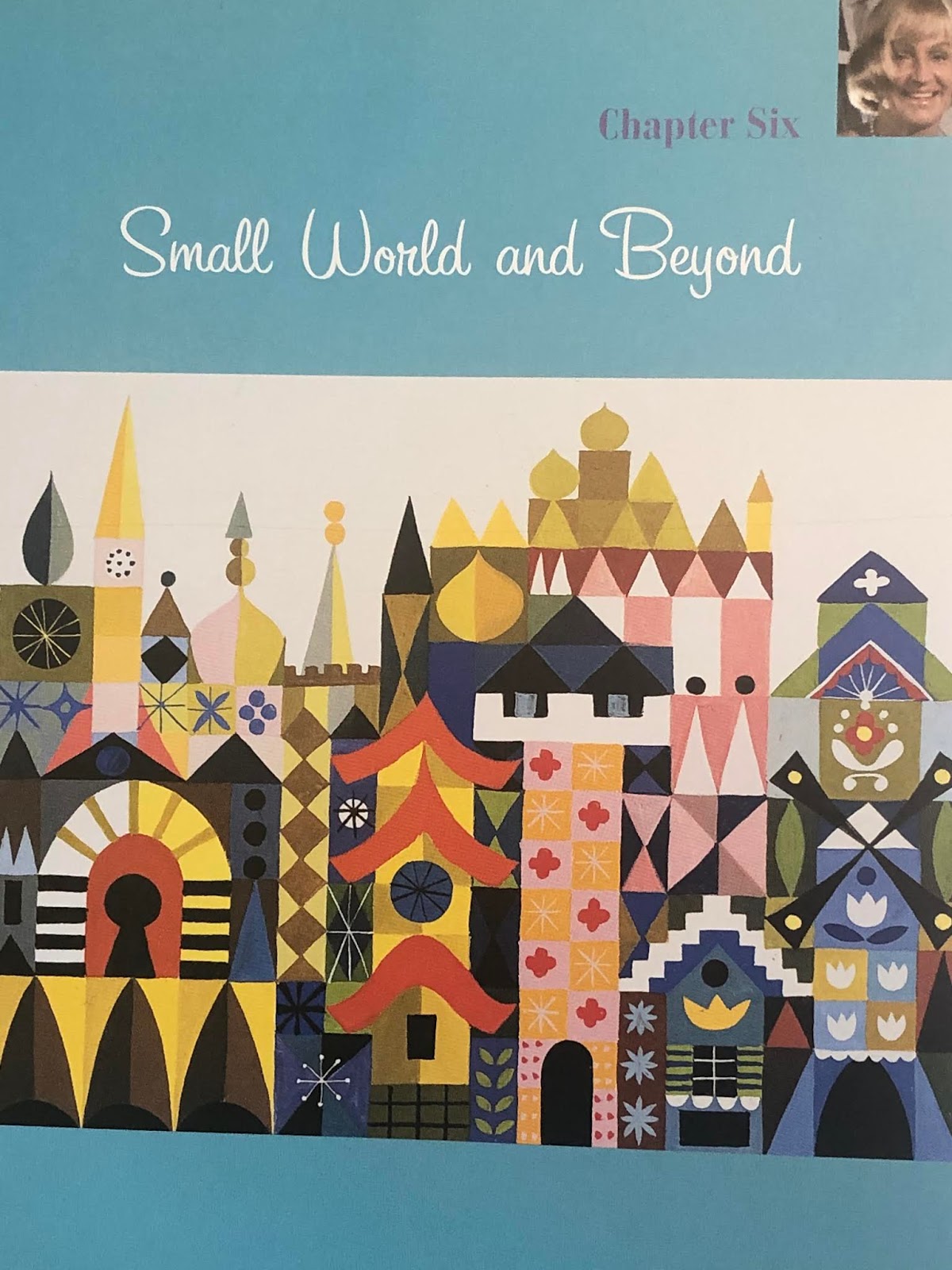
On being asked to design It's a Small World...
"I think it hit her at the right time. It was a powerful package for her," says Crump. "It was about children, the freedom of color, and that Walt asked her to do it. Like she'd died and gone to heaven. Small World had to be the crescendo for her because I've never seen anything as powerful in her work. She just whipped this stuff out."
Designing children from around the globe and their environments, Blair made dozens of intricately detailed collages. Her assemblages used wallpaper cuttings, cellophane (for a transparent effect) and acrylics, ingeniously combined in interlocking geometric and organic shapes. These dazzling constructions- breathtaking in their whimsical vitality and variety- contain her purest color combinations yet.


Brilliant artist..wonderful blog!! Found you after searching Corinne Malvern
ReplyDelete